Spalouvè — a fragrance brand from first sketch to finished label
Gold, grey and plenty of white, a narrow serif and a 45 × 45 millimetre label — a small brand gets its feel from the details.
Summary
Spalouvè sells scented candles and reed diffusers in two scents, Vanilla & Peony and Musky Floral. Between 2019 and 2020 we developed the brand's logo and emblem, the labels for both scents, colours and typefaces for the web, a WordPress website and a set of twelve icons.
The brief
Spalouvè sells scented candles and reed diffusers in two scents. We were asked to develop the brand's identity, and it had to work on a small label as well as on a website.
The work went in steps: several logo proposals, a chosen emblem and logo in September 2019, labels with a print specification, the website and finally, in 2020, a set of icons.
From proposal to logo
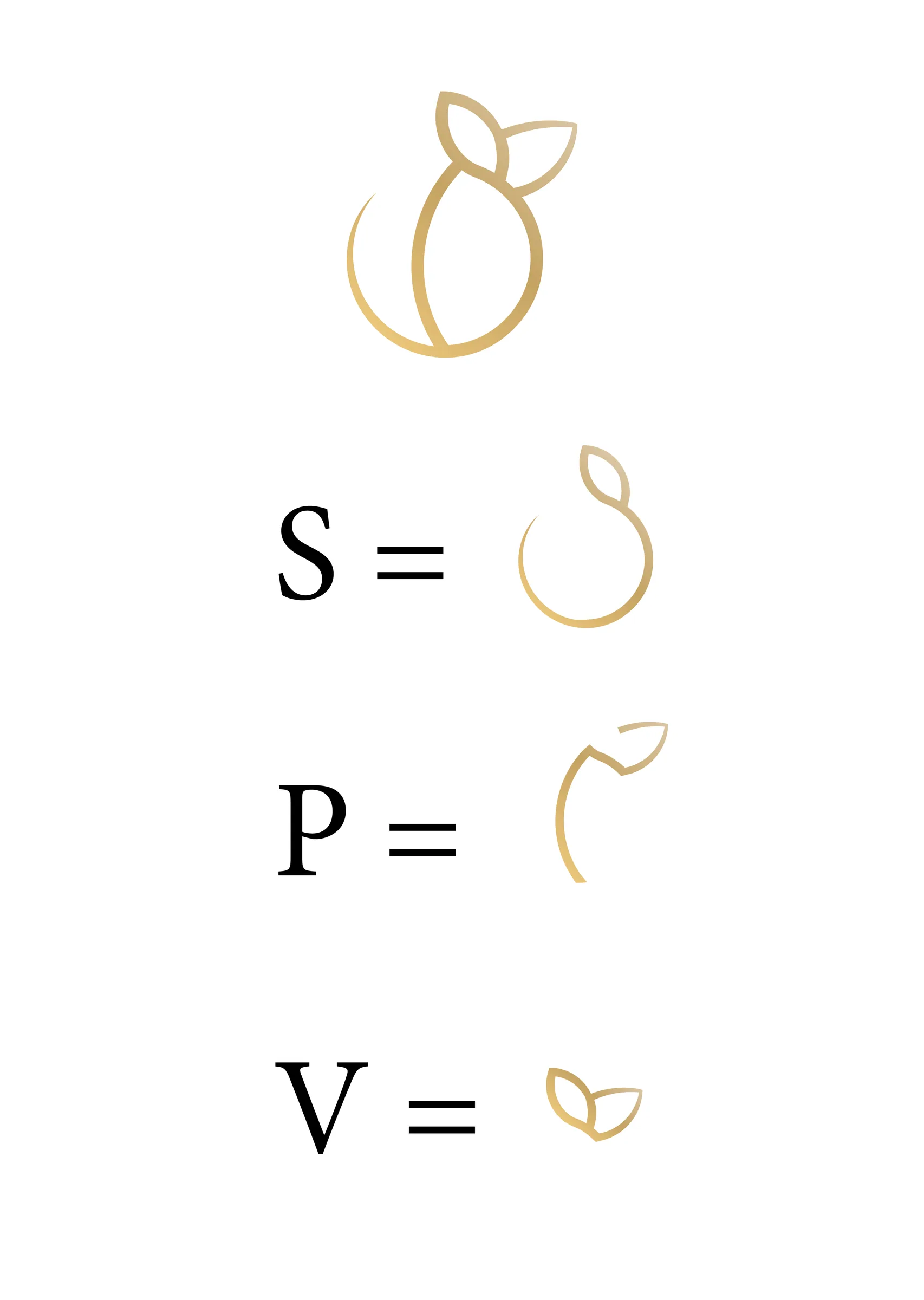
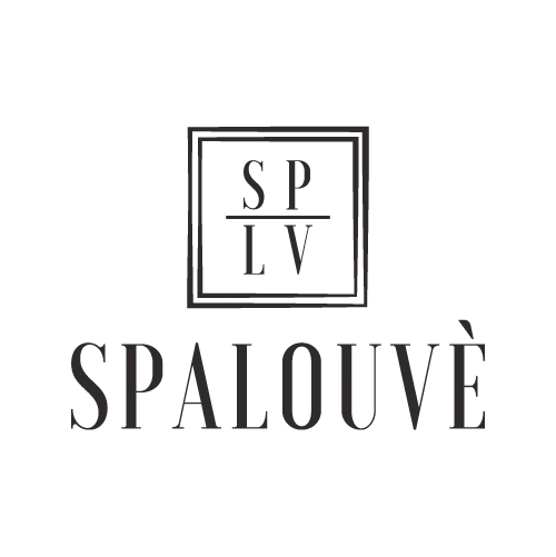
One of the early proposals built the emblem from the letters S, P and V, shaped like a fruit with leaves. The chosen route was more restrained: the letters SP over LV in a double frame, above the name.
The labels
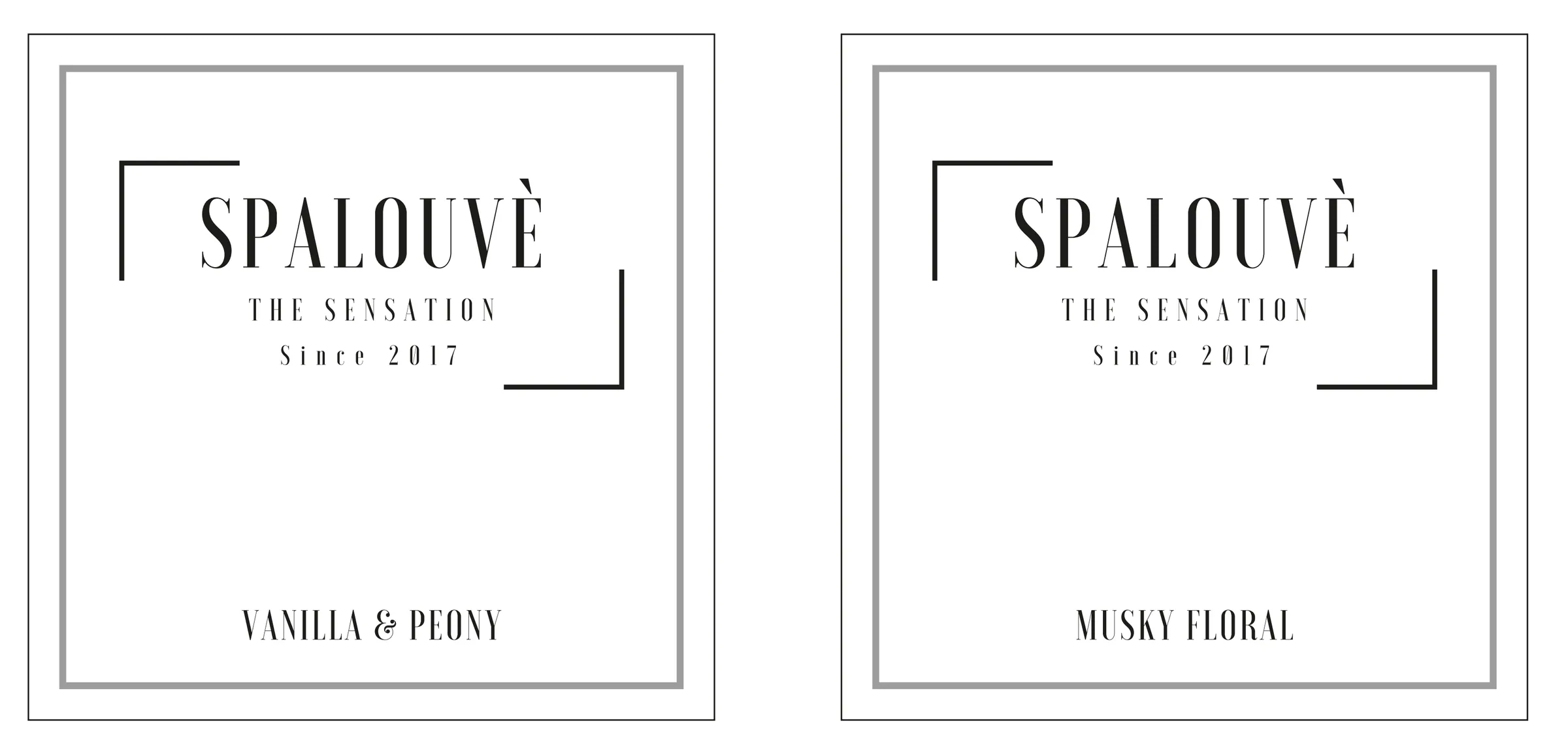
The label is 45 × 45 millimetres, printed in silver and black on white linen paper. It carries the name, the line THE SENSATION and the scent, and two corner lines frame the name the same way as in the emblem.
One label works for both scents. Only the scent name at the bottom changes.
Colours and type
The web colours are three golds, two grey backgrounds, white and a grey text colour. Headings are set in Kantumruy and body text in Futura.
- Light gold#DDC9A8
- Gold#ECC87C
- Burnt gold#C7A465
- Light grey, background#F3F3F3
- Grey, background#B5B5B5
- Grey, text#7A7A7A
Twelve icons
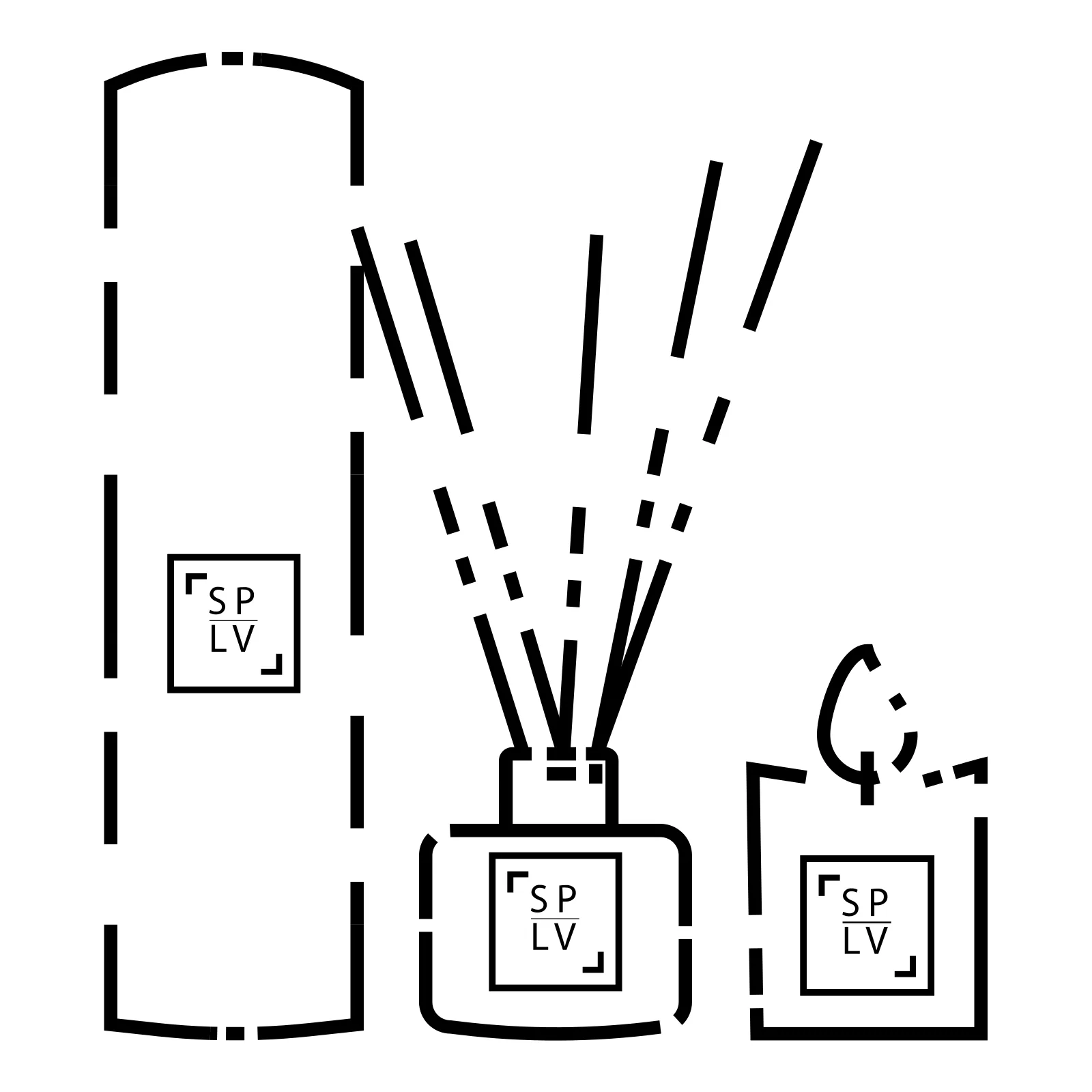
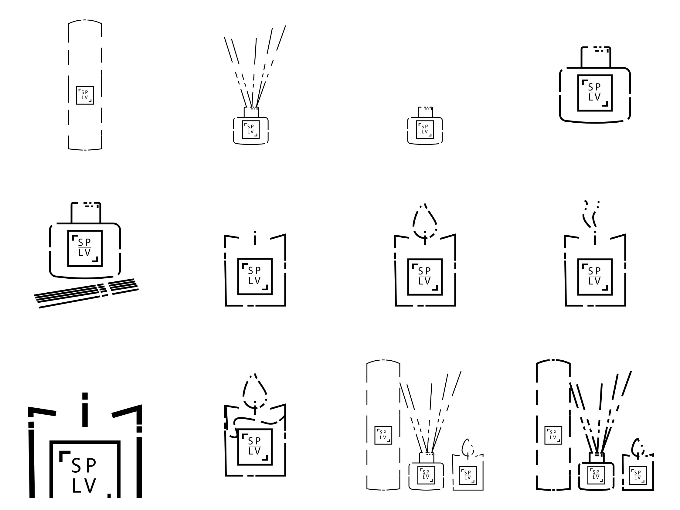
In 2020 we drew a set of twelve line icons. They show the products and how they are used: the packaging, the bottle with reeds, the candle untouched, lit and put out, the wick and the wax.
Every object carries the same SP/LV emblem as the logo, and the lines are dashed the same way throughout the set. The icons were delivered as SVG and PNG.
Our work
- Proposals: Several directions for logo and emblem before one was chosen.
- Identity: A logo in three parts — the full logo, the emblem and the name — in light and dark versions, for print and for the web.
- Labels: One shared label for both scents, with a print specification.
- Web: Colours and typefaces for the web, web design and a WordPress website at spalouve.com. The site is no longer online and was never archived, so it isn't shown here.
- Icons: Twelve line icons in the brand's visual language, 2020.
What we built
- Logo, emblem and wordmark in light and dark versions, for print (EPS) and web (PNG)
- Labels for Vanilla & Peony and Musky Floral — 45 × 45 mm, silver and black print on white linen paper
- Web colours and typefaces: three golds, grey backgrounds, Kantumruy and Futura
- Web design and a WordPress website at spalouve.com (no longer online)
- Twelve line icons as SVG and PNG (2020)
Typefaces and tools
- Kantumruy
- Futura
- WordPress
More projects


Got a similar project?
Tell us what you want to achieve and we'll come back with how we'd approach it.
Book a free consultation